Monday, April 18, 2011

Wallace Collection


1. Labels. Wallace Collection
Share your thoughts on the identification of paintings within the Wallace Collection. Do the titles and artist names feel more integrated with the art when engraved/painted upon frames? Do you prefer object labels (separate labels outside of frames)? What feels appropriate for this collection?
            I thought the way that the Wallace Collection labeled their art was incredibly fitting and appropriate for this type of collection. This collection seemed to be more elegant, ornamented and aesthetic so by having the artists names and titles of the paintings engraved within the framing rather than just a simple and unadorned text panel really worked well for this type of museum. Many times I do enjoy and expect text panels since I haven’t been much of an art lover and understand art work better when it is explained to me, but in the Wallace Collection case, I’m very happy there weren’t text panels. It didn’t need explaining and it felt like more of a home-like atmosphere with the paintings just hanging on the wall to decorate your house.

 2. Object of Appreciation. Wallace Collection
What object captivates your attention and why?
            Jan Fyt’s Still Life With A Page picture really captivated my attention and is no doubt a piece I would like to see again. I would also love to know more about Fyt because all of his paintings seem to be very different and interesting having to do with random animals put together. This caught my attention because of how weird it is in all honestly. It’s a table with the most random objects put together like a lobster, a monkey, a dog or cat, a lot of fruit, birds and many other things that I couldn’t even pick out myself. I haven’t seen a painting this randomly put together and I thought it was incredibly intriguing. I want to know what went through his mind to put together a painting like this one.

3. Object of Excessive details/ornamentation Wallace Collection
What object either intrigues or disgusts you based upon ornamentation (ornate or lavish detailing)
            There were many objects that intrigued and disgusted me but if I had to pick one I would pick the Pair of Ewers porcelain vases. I just thought these were incredibly over ornamented. I don’t see it necessary to put a million little “ewers” or flowers covering the entire vase. I think it could have the same, if not way better, beauty and aestheticism if there were a few flowers placed strategically on the vase and a more simple or less elaborate handle. I just don’t like things that are this showy and embellished, I prefer a lot more simple pieces that aren’t overwhelming.

4. Favorite Museum
Please tell me your favorite Museum experience and why?
            I find this to be an incredibly hard question because I really did enjoy all of our museum experiences but if I had to pick one I would say the Saatchi Gallery. I just thought these exhibits were absolutely amazing and definitely unlike anything I have seen before. They were so different, amusing and a breath of fresh air. This museum had such diversity and I wouldn’t have been able to classify this museum in one category like I could potentially do for many of the other museums. Additionally, this was my favorite museum experience because this was the only museum where I would stand in an exhibit with friends and speak about each piece individually and what we thought the piece represented. We were able to bounce ideas off of each other and laugh at what I thought something was or how my friends interpreted a piece.

5. Museum Interest
Do you have a greater interest in visiting Museums after taking this course? Were you previously intimated by art? Do you have a greater interest in museum branding / design (logos, labels, mapping, graphics)?
            Being honest, I really wasn’t looking forward to this class. I didn’t want to visit a new museum every single week, analyze paintings or logos, answer questions about the museum or really do anything related to museums. I have never been a museum lover because I tend to get bored and very ancy. But now, I can tell you in all honestly that I absolutely have a huge interest in visiting museums and have a way larger appreciation for art. Like I’ve said earlier, I have never been one interested in art so of course I was intimidated by it because I always felt like an idiot when I couldn’t appreciate the art or understand what the artist was trying to show us. I know understand that I don’t need to know a lot about art to enjoy and appreciate it. I can just go to a museum and look at the art and appreciate it for what it’s worth. And now, through this course I have learned that there will always be at least one or two things in a museum that will interest me and make me think. I know that when I go back to the states I will be visiting more museums that I have in the past, no doubt.

6. Any additional comments
Feel free to share any additional comments...
            I just want to say how much I really have enjoyed this class and how much I have learned about art and branding. I never thought I would be taking a class like this but couldn’t be happier that I did. So I just want to thank you so much for allowing me to have the opportunity to visit all of these museums and have a different experience tha

Monday, April 11, 2011

Design Museum

Brit Insurance Design Awards: Your Vote
Which design would you honor for innovation in the following categories:
(list the object title and provide a two sentence response for the innovative selection)

Architecture: Origin Part 1: Join
            This piece of architecture really caught my eye. This piece is 3 space dividers made out of Japanese wood, each piece being two linear frames. The reason why this caught my eye is because of how intricate the design looked. There are so many pieces of wood crossed over each other, parallel to each other and then all of the three uniquely created dividers were put together. I also really was interested in the idea that this piece of work represented integrity, was handcrafted, and barely any glue or tools were used to make this piece. It must have taken a lot of work, concentration and preciseness which makes this piece even more fascinating.

Furniture: The Solo Bench
            This piece was definitely one of my favorite in the entire gallery. I have always really enjoyed nature and Domingos Totora loved nature as well. This bench is made out of recycled cardboard. I was touched by this piece because so many businesses would just discard all of their cardboard and Totora found a way to put that recycled rubbish to use. I many times take things like that for granted where either I don’t recycle or I waste paper and other such materials that could come into great use. I was inspired by his use of everyday objects to make beautiful pieces of work.


Transport: Ohne Titel Spring/Summer ‘11
            I am obsessed with these shoes. If I could transport myself around the city and world with these shoes I would be honored. They were designed by Flora Gill and Alexa Adams and were inspired by a Japanese artist. All of the different bright colors used are captivating and the modernized/futuristic look of the shoes is compelling. I feel in love at first sight.

Graphics: Reactable Mobile
            Designed by Reactable Systems, I see this instrument as incredibly tempting. Although I’m sure it is more expensive than a guitar or drum set, it is so mobile and transportable. You would be able to bring it everywhere and anywhere that you go. It would just be easier for DJ’s to use because they wouldn’t have to bring their entire music set but yet they could just bring this one object. I also think that this would give want-to-be DJers an opportunity to try out their skills on their own time rather than being embarrassed with others hearing them. And they would be able to practice 24/7 hopefully allowing them to become famous one day with their incredible skills.

Describe your impressions of the exhibition. Is the work of Wim Crouwel too minimal? Do you prefer graphics with more visual elements? What adjectives describe the exhibition? 
            Surprisingly, I really enjoyed this exhibit. When I first walked in I was completely confused and uninterested in this exhibit, but once I walked around and read the text palates I was able to appreciate this exhibit for what it was. I’ll have to admit, Crouwel’s work was a bit minimal and simplistic but because of the amount of information the exhibit provided me with, I was eventually able to respect the exhibit. On the other hand, usually I do prefer graphics with more visual elements but for some reason after seeing this exhibit, I didn’t care. This was something like I had never seen before and I really enjoyed it.
            Three adjectives that I would use to describe this exhibition are educational, attractive and simple. Although simple may be on the complete opposite side of the spectrum, I think that the exhibit contained all of this and more. Like I said earlier, this exhibit was educational because of all of the text it provided us with. I didn’t know anything about Crouwel before coming to this exhibit but once I left, I felt much more knowledgable because I learned something new about someone new. I see this exhibit as attractive because of the colorful posters lining the white walls with additional work mazing through the middle of the exhibit. Lastly, I find this exhibit simple because on the artwork there wasn’t much text or detail as well as there wasn’t much complexity to the layout of the exhibit.

What fine artist or artists (painting, drawing, sculpture, mixed media) come to mind when you look at the posters of Wim Crouwel. For instance do you see any resemblances to the shapes of Jackson Pollock? Do the colors of Mark Rothko emerge in the posters? Do the repeated shapes on the wall appear like a Donald Judd sculpture? Perhaps think of an artist you have discovered during this London journey. Or research an artist working during the same time period? 
            I see similarities between Crouwel and Donald Judd because of the simplistic and minimalistic styles of art they both use. As mentioned earlier, there wasn’t much complexity to Crouwel’s posters or calendars or other pieces of work, which I see as well in Judd’s work with very repetitive pieces and shapes on his artwork. Overall, I am starting to have a clearer and more open-mind to this sort of simplistic and minimalistic type of artwork.

Monday, April 4, 2011

Saatchi Gallery

This was absolutely my favorite museum we have visited so far. It was so unique and so different from any art I've seen before. I will definitely be going back to this museum.

Sightlines
Does this gallery enable various sightlines (lack of interruption or multiple vantage points) to engage new methods for viewing objects? Does this depart from other museum visits? 

This gallery absolutely enabled various sightlines which helped me view objects very differently from ever before. By having some objects and pieces of work in the middle of the room, on the floor and in the corners of the room while others were hung on the wall, I was able to walk around the objects and see every side and corner to the piece which allowed me to analyze the pieces to a greater extent. For example, the "up" and "down" pieces were by far my favorite and if they were hung on a wall I wouldn't have been able to feel the full effect of the piece. I liked how this was very different from all the other museums we have visited. It gets boring when the whole museum is just paintings and drawings hung on a wall. By having pieces in the middle and on the sides of the room, we are able to have more of an "interactive" experience, which makes my visits more intriguing.

Didactics
The galleries present minimal text in relation to the art. Is the text adequate? Do you desire more information –and if so –what information would you appreciate?

I feel torn on this question. I have never been one to analyze art or really have that creative of a mind to figure out what the artist was thinking while creating their pieces of art. So usually I desire more information than just the name. Many times I like to know the background of the artwork so maybe where they were when they did the painting, what were their influences, what was the artists background, etc. The Saatchi Gallery really only provided the name of the piece. So the reason why I am torn is because this artwork was so unique and so different than anything we've seen before and so in a way I really liked that they only gave us the name of the piece because then we were able to use our own minds and analyze the art in our own way, basically being "artists" ourselves, which could have been the intent of the artist. On the other hand, many times I had zero idea of what the art was and I became incredibly frustrated and would just walk right past the art not allowing myself to fully appreciate it for what it was. So overall, I was incredibly happy that we had a tour guide for the beginning of our class. She was so helpful because by her explaining the pieces of artwork that I would have never guessed what they were, I was really able to understand the piece of art and was able to spend more time at the piece examining it. Overall, if a museum isn't going to have an adequate amount of text to describe the pieces then I would prefer having a tour guide explaining some of the pieces.

Collection
Do you find the works on view more adventurous than museums? Or is some of the work questionable in craft, subject matter, and composition?

Absolutely. I thought the work in the Saatchi Gallery was incredibly diverse and multifaceted. Although I did feel violated and a bit uncomfortable by some of the work (the SPAM piece), overall I really enjoyed the pieces. I liked how the work wasn't from artists that everyone knows but rather they were new and up and coming artists who wanted to be seen. The gallery wasn't trying to compete with anything or anyone, the pieces weren't regarded as successful or popular. This gallery allowed me to open up my mind and reach into my creative side and figure out what these objects and pieces of art represented. I also liked (in relation to the first question) how differently organized this gallery was with some art being in the middle and on the sides of the room and others being hung on the walls. I also liked how it wasn't all paintings and drawings. Some were pictures, sculptures, collages, posters, etc. It was just a random assortment (or what seemed to be) of different types of art and it really made my brain's wheels turn. 

Monday, March 28, 2011

Street Art

I really enjoyed this assignment because although I have explored a lot of London, this made me more aware of my surroundings. Although I was just walking to walk, as I walked my head and eyes were always moving and examining my surroundings. It was a lot more interesting than just walking with a bunch of friends, chit chatting and not being aware of what's around you. So even though I found a ton of street art, here are a few examples of what I found.

As I was on my way to Hammersmith, I decided to stop in Kensington Gardens and walk the back paths that I hadn't walked before. Thank goodness I did that because this is where I found my favorite piece of "street art."

I just find this to be incredibly funny. I didn't even notice it at first but I turned my head and this is what I saw. It's 3 stuffed animal mice holding a plastic gun! How funny is that?! I think that this absolutely enhances the landscape and fits with the surroundings. I've walked through Hyde Park so many times and seen rodents running around and they always freak me out, just like this did. It's so creative but so suttle that you have to really be paying attention to what's around you to notice this. I don't see this doing any harm to the environment, just giving it a little something else. I see it as representing what's around us (all the stupid rodents) and maybe this "artist" put a gun with the rodents because they think that most people want the rodents dead (or at least I do).


As I continued to walk down High Street Kensington, stopping along every side street, and continuing on walking to Hammersmith, I came across this piece of "street art."

I don't necessarily think that this one fits with the landscape. Everytime I see stickers and such on pieces of land, I think it is graffiti and is ruining the beauty of the landscape. I love nature for what it is and when "unnatural" things are put there that didn't start there, it ruins the aestheticism of the surroundings. I saw this sticker in two different places as I was walking. The first three were found on High Street Kensington and the last one (light blue) was found on an Earl's Court Street Sign on the way to Hammersmith. I just think they are completely out of place and I would have preferred them if they were on a telephone booth instead.


I think this one is brilliant. I had never seen this before but I think it is so creative and absolutely fits with the landscape and the sign above. It makes the speed limit more noticeable and more "easy-going" persay. It adds some fun and creativeness to a strict rule. The only thing that I don't understand about the sign is why there is a lady bug on it. Who wants to kill a lady bug? It could off maybe had a cigarette crossed out (killing two birds with one stone there saying kill your speed and kill the smoking) or something like a peace sign showing the idea of killing bad things (like going to fast on the road) will help bring about peace. I don't know, those are just some thoughts because I'm still confused on why there would be a ladybug. But overall, I thought this street art was incredibly intriguing and very creative.

(For the pictures below) Graffiti. Who feels the need to have to put a little sticker on a beautiful street sign? I'm sure this sticker has some sort of significance and means something, but there's no way I know what that is. They could of at least put the sticker on the brick wall underneath the sign but just shouldn't of put it on the actual sign. Here are a few more examples of stickers being put on places that they shouldn't be, in my opinion.


 I think this "Kende" sticker is a little bit more acceptable. It's on a trash can that looks very old and disgusting so it's a bit more reasonable that it was put there. It's not really ruining the "beauty" of the trash can or landscape, it's really just adding to it, making the garbage bin look more like garbage.

I thought this picture was just incredible funny and kind of creative. It looks like it's two monsters put into one. One monster as being the whole body with a little head and then the funny monster on the inside with the glasses. It definitely is an imaginative drawing, but once again, can't it be placed somewhere else rather than on a street sign?

Monday, March 21, 2011

The Sound of Music


         Being in Brussels, Belgium last weekend I had to find a way to keep myself busy. After walking around the city, going to the parks, shopping and eating all the chocolate we possibly could…it was only Friday afternoon and I still had a day and a half left in Brussels. There were no big tourist attractions to see. There was no need to wake up at the crack of dawn and exhaust ourselves by 3 pm because of the rushing around to see everything. There were no places to travel around Brussels that were worth traveling to. So what were we supposed to do? Why the hell was I there? Well, unfortunately I’m still not sure why I was there. I guess it was to see my best friends and go to the most amazing concert ever…but that was only for Saturday. Why the hell was I there two days in advance? Well, I don’t know. But we figured out a way to keep ourselves busy. Go to the Musical Instrument Museum. 

            As we entered the museum we weren’t really sure what to expect. We knew they had a ton of instruments showcased but were we just supposed to walk around the museum for hours and look at instruments? Sounds boring to me since I have never been interested in music. When we entered, we were handed headphones and were told, it’s okay there are no words. We had no idea what that meant but just went with it. As we walked to the first floor and opened the doors to the first exhibit, I was in utter shock. There were over 1,500 instruments on display, each room the size of 2 Foundation House classrooms put together. It was unbelievable. I was overwhelmed but intrigued. I wanted to see what these headphones had to “say” for themselves and what all these instruments were about. There were four floors in the museum, each exhibit as small as the next, with even more instruments in each room. Each floor had a different genre of music. The first floor being Mechanical Instruments having music boxes, barrel organs, pianolas, etc. The second floor being Traditional Instruments having wind, string and percussion instruments. The third floor being Modern Orchestral Instruments and the fourth floor being Strings and Keyboards. I was fascinated.

            We put on the headphones and nothing was heard. We tried to mess with the volume and all the other buttons but still, nothing was heard. We finally realized that you had to stand right at the display case and when you did that, the most wonderful music would play in your ears. When we stood by the guitar case, we heard the most beautiful strings. When we stood by the flute/harmonic cases, we heard amazing notes. When we stood by the drum cases, we heard unbelievable beats. The music never stopped. It was such an eye-opener to hear some of the most astonishing sounds that I never thought were possible to be made. We ended up staying in the museum for three hours, every minute spent listening to such engaging and delightful music. And of course, we ended our musical adventure at the top of the museum with a lovely cup of tea and pastries while looking out at the horizon of Brussels, Belgium.  
           

Sunday, March 6, 2011

National Portrait Gallery

1. Critique the logo
Does the logo relate to the architecture, galleries, and collections? 
Do you have any suggestions based upon a collection surrounding portraits?

 Although the logo looks more like just a typeface, I for some reason really like this logo. I love the font that was chosen and I also like how all three words are the same size, one not overpowering the other. I see many similarities to the museum but also some differences. The museum is very different in it's collections while this logo is very simple and straightforward. But, the museum's architecture and layout was very manageable and basically dummy-proof which is much like the logo, plain and uncomplicated. If they were to change the logo I would just like to see maybe a bit of color as well as the words not being written out in full (something like the V & A logo). Overall, I really don't have a problem with this logo even though I did have a problem with the National Gallery. 
 
2. Self portrait
Which portrait best identifies your personality, mood, time period in which you would have lived, clothing, etc... (3 - 4 sentence caption)... 

 I chose Emma, Lady Hamilton as the portrait that best identifies with me. I'm going to be honest, I'm not exactly sure why but I think the reason I was drawn to it was because i really liked the position that she was in for her portrait. She seemed to be a confident, outgoing, friendly and sociable person which are 4 qualities I see in myself. She also had some sort of headband-like accessory around her head and it reminded me of something a hippy would wear. Embarassingly enough, I have always dreamed of being a hippy and living in that generation (that is why I have colored my dress the way I have). I also put a Jewish star necklace because I am proud to be Jewish as well as a peace sign symbolizing hippies as well as wanting peace in the world since I see myself as always being the peace maker in situations. 


3. Study abroad friend
Which portrait best identifies the personality, physical attributes, mood, costuming, etc of a study abroad friend... (3 - 4 sentence caption)... 

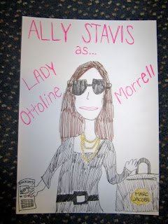
 I chose to represent Lady Ottoline Morrell with Ally Stavis. Lady Ottoline was a society hostess and for some reason I really saw Ally being wonderful as a hostess in this way. She befriended writers and artists and liked intellectual talks. I see Ally being famous one day, making a big name for herself and being friends or acquaintances with big time writers and artists. I also of course had to add the wonderfully large sunglasses Ally wears night and day, her blackberry that she is on constantly and her awesome Marc Jacobs handbag. I don't see Ally anywhere without these 3 essential and must have objects. 

4. Study abroad friend
Which portrait best identifies the personality, physical attributes, mood, costuming, etc of a study abroad friend... (3 - 4 sentence caption)... 

 Oh Mandy. I chose Octavia Hill to represent Mandy. Octavia Hill always helped house the poor and was involved in numerous charitable activities. Mandy wants to work as a non-profit, social action person in the future so I saw a lot of similar personality traits between Octavia and Mandy. I of course had to add Mandy's sunglasses that she will wear any second the sun is out, her scarf which she has a thousand of, her watch that she never takes off even though the glass is cracked, a heart on her sleeve because she wears her heart on her sleeve, and I couldn't forget the love of zebra so I colored her shirt in a zebra pattern. 

5. Study abroad friend
Which portrait best identifies the personality, physical attributes, mood, costuming, etc of a study abroad friend... (3 - 4 sentence caption)... 

 I chose to represent Karl as John Bunyan because he was a writer and a preacher. Every time I speak with Karl he always has the most inspiring and well-thought out things to say, i'm intrigued every time. He also is very involved in spoken word and rapping so I once again saw a lot of similarities between Bunyan and Karl. Bunyan was holding a book in his portrait so I titled that book Preacher Rapper Guide because that's Karl's life. I also added Karl's huge headphones that he has on him 24/7, as well as an ipod to represent how important music is in Karl's life.

6. Study abroad friend
Which portrait best identifies the personality, physical attributes, mood, costuming, etc of a study abroad friend... (3 - 4 sentence caption)... 

 I chose to represent Sean as Sir William Turner Walton. When I saw Walton's picture I immediately thought of Sean. I just see Sean sitting outside looking over the ocean with mountains in the background smoking a pipe, drinking some brandy and writing his novels. He loves to write and also LOVES the beatles so I imagine him writing a novel on some aspect of the Beatles life when he gets out of college. 

Wednesday, February 16, 2011

The National Gallery

1. Critique the logo
Is this just a typeface?  
After viewing the collection, would you propose a different typeface or a symbol?
When I first arrived at the museum I spent about 4 minutes looking around and trying to find the museum’s logo. After finding a map and looking at the front of the pamphlet I realized the museum doesn’t really have a logo, or at least I wouldn’t say it was a logo. All it was was “The National Gallery” with the word “National” being a bit larger than “The” and “Gallery”. So yes, I would consider this just a typeface. I would think that it would get a bit exhausting and annoying having to write and write “The National Gallery” on every single piece of work that the museum has it’s name on. Wouldn’t they want something a little simpler and even smaller perhaps? Additionally, after viewing the collection, I was a bit confused on why their “logo” would be so plain and simple. Most of the paintings were very intricate and detailed, looking rather picturesque. But then when I went to relook at the “logo” it was so ordinary and basic. If they wanted their “logo” to be more like the collection, they should of made it more elaborate and pretentious. Overall, I would definitely propose a different logo all together. It shouldn’t look like just a typeface, they should come up with more of a symbol or label, maybe not having the whole “The National Gallery” in it but possibly coming up with some sort of abbreviation like the V & A museum. The V & A Museum didn’t write The Victoria and Albert Museum on everything but rather came up with a simpler way to represent the title of the museum.

2. Van Gogh
In your opinion, do the van Gogh paintings live up to their position in art history? Feel free to discuss: line quality, gestural brushwork, color, mood, subject matter, etc. You may also feel free to compare and contrast two van Gogh paintings (to elaborate on your level of engagement).
I have always enjoyed observing Van Gogh’s paintings but I’ve never thought about if Gogh’s paintings live up to all the hype. Now thinking about it, I honestly do not think they live up to the hype. Yes, they are gorgeous pictures with beautiful gestural brushwork and color. Yes, each individual painting has it’s own mood and feeling to it. But, overall I do not think his work is as “artistic” as others. It also depends on what kind of art one likes. I personally do like the more abstract, modern looking art. But, if I were to compare his art to another artists, let’s say, to Julius Schnorr Von Carolsfeld’s painting of Boaz’s Field Painting, I would have to say that I don’t think Van Gogh lives up to the hype. Carolsfeld’s painting looks exactly like a picture. It is incredibly detailed, elaborate, precise and specific and I wonder how long it took Carolsfeld to complete the painting. With Van Gogh, it doesn’t look like it was a perfect picture taken. I love the more abstract-type of painting like Van Gogh does compared to Carolsfeld but for some reason I just think that other artist’s should have a higher position in art history. Sometimes it makes me think that maybe Van Gogh has a high position in art history just because he cut his ear off rather than because of his paintings, but who knows. While comparing Van Gogh’s chair with A Wheatfield With Cypresses I would say in the Wheatfield painting, the brush strokes and the colors are absolutely beautiful. You can see every stroke Van Gogh must have made and you can see how articulate he must have had to been with all of the wheat sticking up from the ground. Likewise, in Van Gogh’s chair you can see each straw individually on the bottom of the chair and you can see the strokes of paint when he painted the door or even the floorboard. But overall, I don’t think he lives up to his hype. I think if he was that wonderful of an artist, he should of tried to paint some more realistic, surrealism paintings to see if he could actually be that detailed and meticulous.

3. Object of Desire
What object from the collection would be suitable for your future home? Describe the characteristics that make this both a desirable work of art –and suitable for your future penthouse, cottage, log cabin, trailer… Please provide artist name and title.
I couldn’t really find a picture that would fit in my future house because I see my future house being more of a modern, abstract, colorful house (a Jewish mother’s house). In the National Gallery I saw many paintings that were more surrealism and incredibly detailed and many that were of religious views. When we went to the Tate Modern I could pick a million paintings that would fit perfectly in my future home, but unfortunately this question was asked for the National Gallery and not for the Tate Modern. So, if I had to pick one I would have picked Claude Oscar Monet’s painting called Water Lillies, Setting Sun. I saw this painting fitting in my future home more than any other painting in the National Gallery because it was the most abstract and had a color palette of green, orange and blues which I really enjoyed. I could see this being in one of my bathrooms or in my husband’s office but not in any of the main rooms. I love the water and the sun so I saw this representing something that I really enjoyed, sitting by a river with my significant other watching the sun set. I love the colors of a sunset and I love the fluidity of the brush strokes in this painting. I also like that it is a very simple painting with no people in it and having it just be a landscape background painting. I also like how the sunrays are being reflected on the water and the branches of the weeping willow. I’ve had a weeping willow tree in my backyard ever since I was born so it would be nice when I move houses to be reminded of my old house. Overall, I really didn’t like many of the paintings in the Gallery like I said before, so because this picture was the most abstract, simple and reminded me of things I like to do, I would have to settle and place this painting somewhere within my future home.

4. Gallery / Display
The National Gallery has the brightest palette of wall color thus far from our museum visits. Do these colors enhance or interfere from the displays? Do you prefer the minimal palette of the Tate Modern in comparison?
I really enjoy the minimal palette of the Tate Modern because I think it emphasizes our attention on the paintings more than the corridors. I thought the colors were beautiful in the National Gallery and I could see some of those colors being the color on my walls in my home but it definitely took my attention off some of the paintings. Many times I would find myself looking at the color of the walls analyzing if this color fit for this specific room, why they chose the color they did and if I could see that color in my future home. I’m not sure why I focused so much on the color of the walls but I think it was maybe because I didn’t enjoy the paintings. Additionally, I felt as if every painting had an extravagant frame around the piece of work. Overall, with the ornamented frames along with the colorful walls, my attention was completely taken away from the paintings and focused on the display.

5. Exploitation / Merchandising?
Does the use of objects from the collection to create merchandise such as handbags, umbrellas, and t-shirts diminish the original work of art? Are certain forms of merchandising more acceptable –and if so what are those forms –postcards and posters? 
Personally, I like the idea of using paintings and pieces of work on different merchandise. I think it gives the work more importance because then it’s not only seen online, in books or in real life but rather it is seen everywhere around the world. Every time I see someone with a bag or an umbrella with a painting on it, it catches my attention. I’m always interested in what painting it is and by whom. Also, many times I don’t read books with paintings in it, research artists and their work online or even go to museums so by seeing it during my every day activities, I am more inclined to research and analyze the paintings. I definitely think there are some forms of merchandising that are more acceptable than others. For example, I think mugs, notebooks, postcards, posters and dishes are completely acceptable and sometimes very beautiful when they have art on them. On the other hand, I think it is hideous when these paintings are on t-shirts, sweatshirts or any piece of clothing. It just doesn’t look right. Mugs and notebooks are definitely my favorite when it comes to art, but many times I don’t find myself buying objects that has paintings on them. I think it also depends on the type of painting. For example, if Carolsfeld’s painting of Boaz’s Field Painting was on a mug or a dish, I wouldn’t like it because it’s too detailed and too articulate. But, if Van Gogh or Picasso’s paintings were on these objects I would appreciate them more and it would be more acceptable.

6. Object of appreciation
Provide a short description of your favorite object from the collections? Please provide label information such as name, date, origin, etc. Why would you return to this object for greater contemplation? 
            Like I said before, I really wasn’t a huge fan of this collection but one of the paintings that did catch my eye was Lake Keitele 1905 by Akseli Gallen-Kallela. This painting intrigued me because I loved the details. I liked how you could see the ripples in the water, the reflection of the clouds and sky in the water and how there was a little island of trees off in the distance. I could picture myself sitting on the beach next to this lake just looking out in the distance and feeling the breeze from the lake on my face. I could also imagine myself in a canoe or kayak just relaxing on this lake. I would like to return to this object for more contemplation because there are these random lines throughout the lake that don’t show ripples or a reflection of the sky but are rather just opaque. I wonder what that is supposed to represent and why Gallen-Kallela chose to paint those 7 various lines on the lake. I would also like to know more about this lake and how it related to Gallen-Kallela’s life or why he chose to paint this lake and not other ones.